<직접 해보기> 레이아웃 만들기
기본적인 웹 서비스의 레이아웃을 만들어 봅시다. flex와 grid 중 하나를 선택하여 레이아웃을 만들어보세요. 레이아웃은 아래와 같이 구성됩니다.
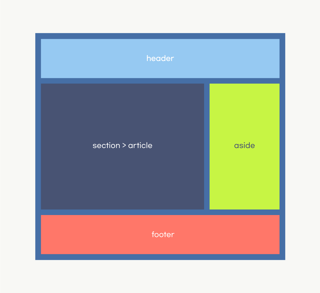
정답이 하나만 있는 것은 아니기 때문에 색, 크기는 자유롭게 작업하세요. 아래는 기본 코드입니다.
<!DOCTYPE html>
<html lang="ko">
  <head>
    <meta charset="UTF-8" />
    <meta name="viewport" content="width=device-width, initial-scale=1.0" />
    <title>Layout</title>
    <style>
      * {
        box-sizing: border-box;
        color: white;
      }
    </style>
  </head>
  <body>
    <div class="container">
      <header>header</header>
      <div class="main">
        <section>section > article</section>
        <aside>aside</aside>
      </div>
      <footer>footer</footer>
    </div>
  </body>
</html><!DOCTYPE html>
<html lang="ko">
<head>
<meta charset="UTF-8" />
<meta name="viewport" content="width=device-width, initial-scale=1.0" />
<title>Layout</title>
<style>
* {
box-sizing: border-box;
color: white;
}
</style>
</head>
<body>
<div class="container">
<header>header</header>
<div class="main">
<section>section > article</section>
<aside>aside</aside>
</div>
<footer>footer</footer>
</div>
</body>
</html>정답
- flex만 사용해보기
<!DOCTYPE html>
<html lang="ko">
  <head>
    <meta charset="UTF-8" />
    <meta name="viewport" content="width=device-width, initial-scale=1.0" />
    <title>Flexbox Layout</title>
    <style>
      * {
        box-sizing: border-box;
        color: white;
      }

      .container {
        display: flex;
        flex-direction: column;
        width: 700px;
        height: 500px;
        background-color: black;
        gap: 10px;
        padding: 10px;
      }

      .main {
        flex: 1;
        /* flex-grow: 1; flex-shrink: 1; flex-basis: 0%; */
        display: flex;
        gap: 10px;
      }

      header,
      section,
      aside,
      footer {
        display: flex;
        justify-content: center;
        align-items: center;
        color: white;
        padding: 20px;
      }

      header {
        background-color: #6fa8dc;
      }

      section {
        background-color: #6d9eeb;
        flex-grow: 2;
      }

      aside {
        background-color: #b6d7a8;
        flex-grow: 1;
      }

      footer {
        background-color: #e06666;
      }
    </style>
  </head>
  <body>
    <div class="container">
      <header>header</header>
      <div class="main">
        <section>section > article</section>
        <aside>aside</aside>
      </div>
      <footer>footer</footer>
    </div>
  </body>
</html><!DOCTYPE html>
<html lang="ko">
<head>
<meta charset="UTF-8" />
<meta name="viewport" content="width=device-width, initial-scale=1.0" />
<title>Flexbox Layout</title>
<style>
* {
box-sizing: border-box;
color: white;
}
.container {
display: flex;
flex-direction: column;
width: 700px;
height: 500px;
background-color: black;
gap: 10px;
padding: 10px;
}
.main {
flex: 1;
/* flex-grow: 1; flex-shrink: 1; flex-basis: 0%; */
display: flex;
gap: 10px;
}
header,
section,
aside,
footer {
display: flex;
justify-content: center;
align-items: center;
color: white;
padding: 20px;
}
header {
background-color: #6fa8dc;
}
section {
background-color: #6d9eeb;
flex-grow: 2;
}
aside {
background-color: #b6d7a8;
flex-grow: 1;
}
footer {
background-color: #e06666;
}
</style>
</head>
<body>
<div class="container">
<header>header</header>
<div class="main">
<section>section > article</section>
<aside>aside</aside>
</div>
<footer>footer</footer>
</div>
</body>
</html>- grid만 사용해보기
<!DOCTYPE html>
<html lang="ko">
  <head>
    <meta charset="UTF-8" />
    <meta name="viewport" content="width=device-width, initial-scale=1.0" />
    <title>Grid Layout</title>
    <style>
      * {
        box-sizing: border-box;
      }

      .container {
        display: grid;
        grid-template-rows: auto 1fr auto;
        gap: 10px;
        width: 700px;
        height: 500px;
        padding: 10px;
        background-color: black;
      }

      .main {
        display: grid;
        grid-template-columns: 2fr 1fr;
        gap: 10px;
      }

      header,
      section,
      aside,
      footer {
        display: flex;
        justify-content: center;
        align-items: center;
        color: white;
        padding: 20px;
      }

      header {
        background-color: #6fa8dc;
      }

      section {
        background-color: #6d9eeb;
      }

      aside {
        background-color: #b6d7a8;
      }

      footer {
        background-color: #e06666;
      }
    </style>
  </head>
  <body>
    <div class="container">
      <header>header</header>
      <div class="main">
        <section>section > article</section>
        <aside>aside</aside>
      </div>
      <footer>footer</footer>
    </div>
  </body>
</html><!DOCTYPE html>
<html lang="ko">
<head>
<meta charset="UTF-8" />
<meta name="viewport" content="width=device-width, initial-scale=1.0" />
<title>Grid Layout</title>
<style>
* {
box-sizing: border-box;
}
.container {
display: grid;
grid-template-rows: auto 1fr auto;
gap: 10px;
width: 700px;
height: 500px;
padding: 10px;
background-color: black;
}
.main {
display: grid;
grid-template-columns: 2fr 1fr;
gap: 10px;
}
header,
section,
aside,
footer {
display: flex;
justify-content: center;
align-items: center;
color: white;
padding: 20px;
}
header {
background-color: #6fa8dc;
}
section {
background-color: #6d9eeb;
}
aside {
background-color: #b6d7a8;
}
footer {
background-color: #e06666;
}
</style>
</head>
<body>
<div class="container">
<header>header</header>
<div class="main">
<section>section > article</section>
<aside>aside</aside>
</div>
<footer>footer</footer>
</div>
</body>
</html>